Just Jade, one of the 5 new In Colors, is so pretty and I can see that I will be using it lots over the coming months. It is a true green and will go with almost every other colour in the Stampin’ Up! collection. Here is how it compares to the other greens:
I ordered the new In Color Designer Paper pack and thought I would show you all the different patterns available in the one pack of paper. I have cut 4 strips and adhered them to a layer of white card.
I took a length of ribbon, tied a bow in the centre of it and then wrapped the ends around the card and glued them behind. This layer was then glued to the Just Jade card base, then decorated with the die cut word sentiments, sprig punches and a stamped fussy cut bird. This image is coloured with Blends Markers and popped up on dimensionals.
A full list of products can be found at the end of this post.
Welcome to the Art With Heart Team Creative Showcase. This month the team are featuring projects using their favourite products from the new Stampin’ Up! 2020-21 Catalogue. The new catalogue is full of amazing new stamp sets, some bundled with dies or punches. The range of kits, papers and accessories complete the range of products you will see featured in this Showcase.
Now let’s get started!
Have you seen this glorious new Designer paper, Flowers for Every Season? Every pattern in the pack is stunning and it has all the new In Colors in it plus Poppy Parade and White!
Flowers for Every Season DSP #152486
For my card tonight, I am using the lovely new In Color, Just Jade along with a couple of other colours from the patterned paper I have selected.
I started with a white square card base and layered some Just Jade card & patterned paper before stamping on the white card using the Stamp in the Round (SITR) technique.
The centre circle features can be cut from the centre of the two larger layers before gluing them down to the base card to get the most out of your products. The sentiment can also be stamped on the larger Jade card and fussy cut. This was stamped in Versamark ink, White Stampin’ Emboss Powder added and heat set before fussy cutting. This circle feature in the centre is popped up on dimensionals and a couple of 2020-22 In Color Enamel Dots scatted across the card to finish it off.
Card layer sizes
White card base: 12.5cm x 12.5cm
Just Jade Layers: 12cm x 12cm and 9.3cm x 9.3cm
Patterned Paper: 11.5cm x 11.5cm
Whisper White card: 9cm x 9cm
This is all I can share with you at the moment, until lots of my other favourite products arrive (they are still in transit through the post). Make sure you follow my blog and you can see those new projects very soon!
A list full of products can be found at the end of this post.
The next contributor to showcase their creativity with you is the very talented, Michele Taylor.
If you find a broken link or have come to this showcase midway, you can view the participants below:
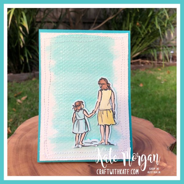
Tonight’s Stampin’ Up! colour is the gorgeous, Bermuda Bay!
I just love this stunning colour and I was very happy with how my card turned out. This Beautiful Moments stamp set is so sweet and I am super happy that it carried over into the new Annual catalogue.
I did a water colour wash on some Water colour paper with Bermuda Bay ink mixed with some Frost White Shimmer White Paint and applied it with an AquaPainter. After it dried, I ran it through my embossing machine in the Tasteful Textile 3D Embossing Folder. I cut the paper down to size and used my sewing machine to add some crazy stitching around the edges as a border. I roughed up the edges with my scissors and then glued it to my card front.
The image is stamped and coloured, also with Shimmer Paint added. Cut out the image and I used my Light Pool Party Stampin’ Blends Marker around the edges so it blended into the background better. This is popped up on dimensionals.
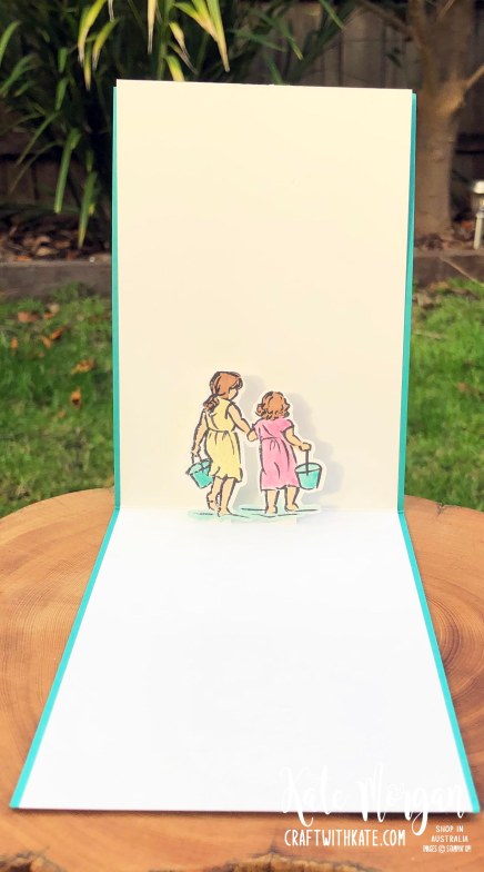
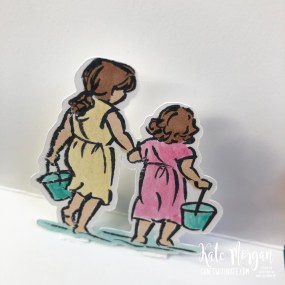
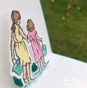
On the inside I wanted to create a pop up card with the stamped image of the two girls. I coloured them the same way.
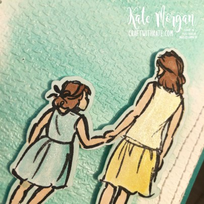
This photo shows them a little closer, popped up (especially with the shadow)!
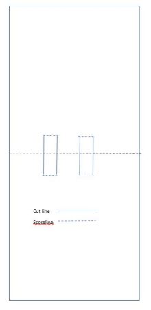
It is very easy to create – simply cut the insert and score it in half. Here is a template:
When you fold this insert in half (valley fold), the two small sections need to pop into the card (mountain fold) to create the small sections. I think you can see it better on this angle. I just measured exactly where these cut lines needed to be and how wide, to sit behind the image of the girls.
Please head over to Cathy’s blog to see all the other participants in this week’s Colour Creations Showcase!
A full list of products can be found at the end of this post.
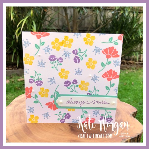
Oh how I love a quick and easy card and this one is just that using Stamps, Ink & Paper (SIP)!
Some simple stamping to create the background and then a punch to create the sentiment.
The Lovely You Bundle is awesome – I love these smaller floral images.
I cut my stamps in half between the stem and the bloom so that I can stamp even faster. By spacing the stamps on the blocks you can have two ink pads open and ink the stamps in different colours at the same time!
A full list of products can be found at the end of this post.
This Lovely You Bundle was also added to my shopping cart as soon as I was able to order it during our demonstrator pre-order period. I just love the smaller floral images, especially because they are perfect for creating the Stamp in the Round style of card (SITR).
By creating a template to use in your Stamparatus, you can stamp an image, rotate the cardstock 90o and stamp again. Continue this process and you end up with a stunning design all in perfect position.
My colour combination
I used the retired wood grain papers on this card, but I have some of the new In Good Taste papers arriving very soon, which are out of this world, amazing! I cannot wait to share some projects with you using those new papers.
A list of products can be found at the end of this post.
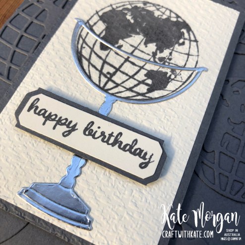
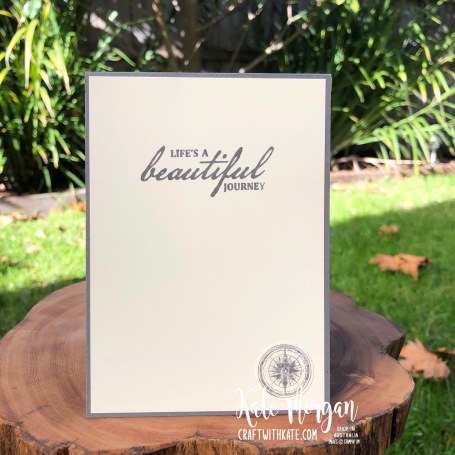
Tonight’s Stampin’ Up! colour to showcase is Basic Gray!
The Beautiful World Bundle is just the perfect product for Masculine cards, or even using with your travel photos in a memory album.
The Basic Gray card base (10.5 x 29.7cm) is folded in half, then I glued some die cut globesin the same cardstock as my feature background. The Very Vanilla layer (6 x 10cm) is stamped with the globe then glued to the Basic Gray layer (6.5 x 10.5cm) and run through the embossing machine with the Tasteful Textile 3D Embossing Folder. Now you can add the Silver stand.
The sentiment is from the Timeless Tulips stamp set and these pieces are cut using the new Lovely Labels Pick a Punch and added with dimensionals.
A simple sentiment is stamped inside and then the compass is stamped and cut out with the 1″ circle punch and glued to the card.
Please head over to Cathy Proctor’s blog to see all the other participants in this week’s Colour Creations Showcase!
A full list of products can be found at the end of this post.
Now that you have seen the new 2020-2021 Annual catalogue, what are your top products that you want to buy or have already purchased? If you are anything like me, I couldn’t wait for 3 June to arrive!!!! 💜
This World of Good Suitewas top of my list (along with a few others, hehe) and I love that we have a few more masculine products to select from this year. I really struggle creating masculine cards, but this suite is just fantastic with all the coordinating products to choose from!
The designer paper I have used today is from the one sheet. I just cut one third off, flipped it over and glued it to my card! This is a great way of seeing both sides of the papers.
Do you see that feather? Well the die doesn’t emboss all that detail on it, so I just used the stylus from my Simply Scored and added all those lines, freehand!
The sentiment is stamped on Early Espresso card in Verssmark ink, White Stampin’ Emboss Powder added and heat set. The Lovely Labels Pick a Punch is new and it is fantastic. You can make 3 different width sizes and 2 different fancy shapes at the ends of the labels and you can make any length, all from the one punch!!!
It is hard to see in this picture below, but the Brass Foiling on the paper is so bright and shiny; it’s a real wow!
A list of products can be found at the end of this post.
Today is the first day we begin this new adventure of the Colour Creations Showcase. You may recall we did one of these with the last colour refresh a year or two ago, and it was loads of fun, so every Wednesday we will bring to you, projects showcasing one particular Stampin’ Up! colour. There are 50 colours in the collection and today we begin with Balmy Blue!
For today’s card I am using the stamp set, A Good Man and some of the new designer series paper, World of Good, along with some other new products available in the Annual catalogue.
My colour combination
The designer paper is given that aged look with the new Old World Paper 3D Embossing Folder. It is just perfect for this project, don’t you think?
The image is stamped with Memento Black ink and coloured with Stampin’ Blends Markers, then die cut using the Tasteful Labels dies. I ran the Saddle Brown Stazon ink pad around the edges of this die cut image (and the Designer Paper) to add that aged look.
On the inside of the card, I added a layer of Balmy Blue and Whisper White card and stamped the sentiment and a heart in coordinating inks.
Please head over to Cathy’s blog to see all the other participants in this week’s Colour Creations Showcase!
A full list of products can be found at the end of this post.
That may sound like an odd question. But, stop and think about it.
Where do you get ideas from? What sparks the creative thoughts flowing? Have you been feeling in a slump lately?
With everything going on right now, I am sure that many are not feeling like their peppy selves or are maybe finding a hard time feeling “creative”.
Keep looking for that creative spark!
The good news is there is only 1 more sleep until the new 2020-2021 Annual catalogue goes live and you can look at all those gorgeous pages of amazing and inspirational photos of new projects!
What are you most looking forward to seeing? I cannot wait to get the new In Color Inkpads!!!!
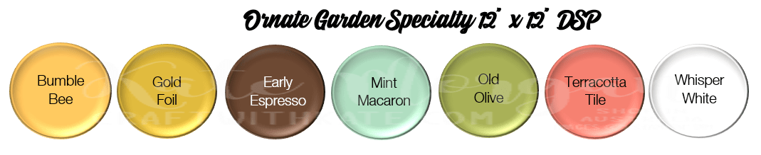
Tonight’s card features the Ornate Garden Suite of products. I stamped the large image on black card with Versamark ink and heat set it with White Emboss Powder.
Then I coloured the entire image with the White Chalk Marker and let it dry before colouring with Stampin’ Blends Markers.
Doesn’t it give a cool effect?!!!
The Designer Paper is so colourful, I actually cut it about a third of the way down, flipped it over to reveal the other side and glued them to the card base. The white ribbon is wrapped around to cover the join! The image was then added with dimensionals.
On the inside, I placed another image in the bottom corner to carry the theme over.
A full list of products can be found at the bottom of this post.
Tonight’s card is a triple fronted fancy fold card using the Peaceful Poppies Suite of products.
These elements and the Designer Paper are retiring, so be quick to add them to your shopping basket before they are gone!
On the inside it opens up like this:
Details
Card base: 27cm x 14.5cm (score at 3cm, 13.5cm, 23cm)
DSP: left front panel, 14.5cm x 2.5cm
DSP: middle front panel, 14.5cm x 4cm
DSP: right front panel, 14.5cm x 8.5cm
DSP: inside centre panel, 14.5cm x 10cm
DSP: inside right panel, 14.5cm x 8.5cm
Belly Band card: 25cm x 3cm
Belly Band DSP: 25cm x 2.5cm
This was CASE’d from Di Furniss, thank you for your inspiration!
A full list of products can be found at the end of this post.


")
")


 Designer Series Paper")


")
")
")


")


 Faux Suede Trim")


 Crinkled Seam Binding Ribbon")


")


")


