![]()
Each week some of the Art With Heart team are joining the Colour Creations Blog Hop to bring you creative inspiration to showcase our range of 50+ gorgeous Stampin’ Up! colours.
Week 24 – Magenta Madness
This is a really bold colour and can be a bit overwhelming, so tonight I have toned it right down by colouring this flower using the Wink of Stella directly with the ink from the lid of the inkpad. This gives a watercolour look, but also gives it a beautiful sparkle at the same time (not that you can see it in the photos)!!!
The Prized Peony stamp set has this gorgeous large stamped image that is inked in Misty Moonlight ink.

The patterned paper is called Harvest Meadow Designer Series Paper and I’ve used the Scalloped Contours dies to the centre piece and the Basic White layer. I made some Faux Resin Dots in Magenta Madness and added some White Crinkled Seam Binding Ribbon, tied in a bow.

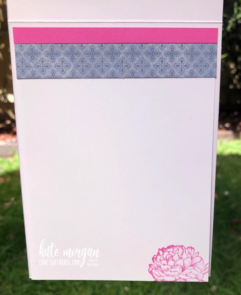
Decorate the inside too!
Thanks for dropping by. All the products used tonight are linked at the end of this post!
Please click on the image below to head across to the next blog on tonight’s hop and see the wonderful inspiration of Di Furniss!

If you come across a broken link or have come from a different entry point, a full list of participants can be viewed on Catherine Proctor’s blog.
♥ Shop Now for Items specific to this project ♥

Don’t forget to Follow My Blog to receive blog updates and join my Newsletter Subscription for all the latest news and specials!


Kate, I love the way you have tioned this colour down – it is stunning with Misty Moonlight. Snap on the stamp set – I adore what you’ve done with this gorgeous peony x
LikeLiked by 1 person
I can just imagine how shimmery your peony is! I love the background paper that you’ve used, it looks very pretty against the bloom.
LikeLiked by 1 person
Such a pretty feminine card, Kate. The soft pink sparkly colour of the flower must be gorgeous IRL.
LikeLiked by 1 person
Oh it would be lovely to see this card in real life to see the sparkle of the Wink Of Stella. What a nifty way to tone down a bold colour
LikeLiked by 1 person
How different does this peony look coloured in a subtle way and on blue. Could hardly recognise it. A fun twist for the challenge Kate.
LikeLiked by 1 person
This is a very pretty colour combination, Kate. I’ve never used that colouring technique … must give it a try. Who knew Magenta Madness could be so muted, and pretty?!
LikeLiked by 1 person
Kate your peony looks beautiful set against that lovely paper. It is just the right tone with the vibrant Magenta Madness.
LikeLiked by 1 person