Each week some of the Art With Heart team are joining the Colour Creations Showcase to bring you creative inspiration to showcase our range of 50+ gorgeous Stampin’ Up! colours.
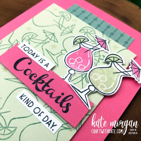
Week 49 – Soft Sea Foam
Soft Sea Foam is from the Subtles collection. Today I have combined it with two of the new InColors for a really beautiful combination.

I have used a Thick Basic White card base, as I find this much easier as a starting point and then I can have a white panel inside to write my message on and stamp any extra smaller images.
Next I cut a piece of Polished Pink card to A6 size and glue it to the front. The next layer is a Strip of the new 6″ x 6″ InColor DSP in Soft Succulent. I selected this piece as it almost resembles bubbles which went with my theme!
The top layer is Soft Sea Foam which is stamped with the glasses in Soft Succulent ink and the stars in Soft Sea Foam ink. This is adhered with dimensionals.
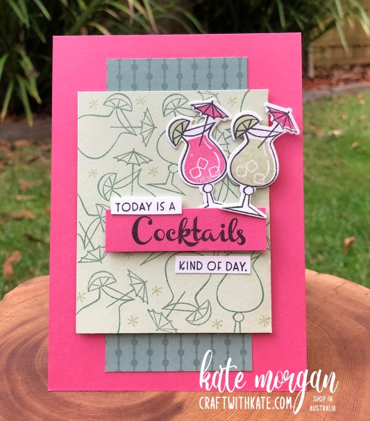
The sentiments and the glasses are stamped in Black Memento ink onto white card and die cut.
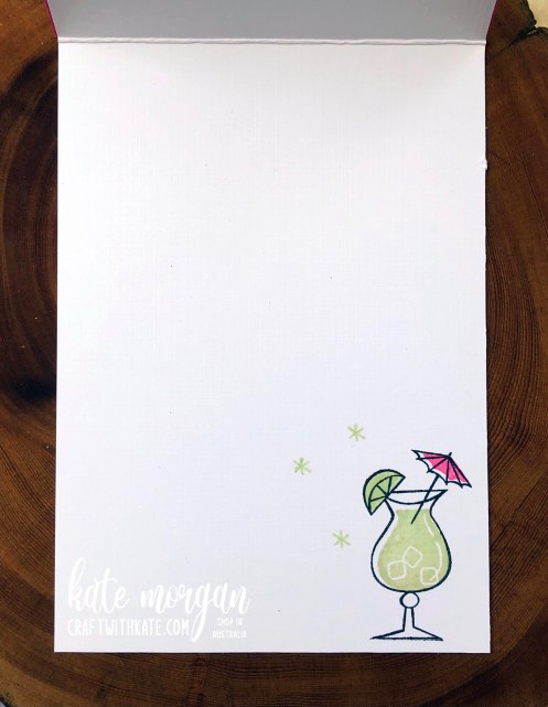
On the inside, I stamped another cocktail, doesn’t it look delicious?!!!
I was super pleased with how this card turned out. As much as I cased it from a photo in the annual catalogue, I changed up the sentiments and colours. Case-ing (Copy & Share Everything) is a wonderful way to get inspiration for your projects if you don’t have an idea floating around in your head already. The catalogues are a wonderful source for inspiration!

Please head over to Cathy’s blog to see the full list of participants in this week’s Colour Creations Showcase. We would love for you to visit each one and leave some comments if you feel inspired.


Be sure to download a PDF copy from my SU Catalogue Library page today.
Don’t forget to Follow My Blog to receive blog updates and join my Newsletter Subscription for all the latest news and specials!


This is going to sound corny – but I could just drink the sweetness from your card Kate. I’ve literally had three cocktails in my adult life and this card makes me want number 4! I love the vibrancy of colour and the design. Gorgeous!
LikeLiked by 1 person
I was about to remark on the fun, retro, look of your card, but I see I’m not the first! LOVE this colour combination, Kate. Your card design is great. Very festive.
LikeLiked by 1 person
Your card is fabulous! The stamped background looks amazing, and the choice of DSP works perfectly with the retro feel of the stamp set.
LikeLiked by 1 person
Your card is gorgeous and fun Kate and yes that cocktail does look delish!
LikeLiked by 1 person
Amazingly bright and happy card Kate. I love your colour combination
LikeLiked by 1 person
What a fabulous card Kate – I love the retro feel you’ve achieved by stamping your own DSP to match the stamp set and your colour scheme looks amazing. Yes, I do want a cocktail after seeing your card!
LikeLiked by 1 person